PAN Foundation: Clinical Trials
May – Sep 2023
Helped debunk myths around clinical trials by guiding patients and caregivers in search of information.

The clinical trials micro-site educates people about clinical trials and the importance of diversity in its participants.
product specs
Responsive Desktop · Mobile · Non-Profit Site
PAN Foundation: Clinical Trials
May – Sep 2023
Helped debunk myths around clinical trials by guiding patients and caregivers in search of information.
The clinical trials micro-site educates people about clinical trials and the importance of diversity in its participants.
product specs
Responsive Desktop · Mobile · Non-Profit Site
PAN Foundation: Clinical Trials
May – Sep 2023
Helped debunk myths around clinical trials by guiding patients and caregivers in search of information.
The clinical trials micro-site educates people about clinical trials and the importance of diversity in its participants.
product specs
Responsive Desktop · Mobile · Non-Profit Site
PAN Foundation: Clinical Trials
May – Sep 2023
Helped debunk myths around clinical trials by guiding patients and caregivers in search of information.
The clinical trials micro-site educates people about clinical trials and the importance of diversity in its participants.
product specs
Responsive Desktop · Mobile · Non-Profit Site
My Contributions
Drove UX strategy by collaborating with content writers to craft a cohesive story and voice when designing the homepage
Owned the site IA and wireframed key pages that provided the groundwork for a flexible, scalable website solution
Crafted a compelling and strategically balanced homepage by facilitating workshops and supporting research efforts, ensuring the voice of the end-user was represented and advocated for
Emphasized the importance of DEI authenticity in site language and structuring, which won us the trust of our stakeholders
Role
Senior Product Designer — UX/UI Design · User Research · Product Strategy · Design System
tools
Figma · Miro · Salesforce Lightning Design
team
1 product manager · 2 content designers · 3 designers
My Contributions
Drove UX strategy by collaborating with content writers to craft a cohesive story and voice when designing the homepage
Owned the site IA and wireframed key pages that provided the groundwork for a flexible, scalable website solution
Crafted a compelling and strategically balanced homepage by facilitating workshops and supporting research efforts, ensuring the voice of the end-user was represented and advocated for
Emphasized the importance of DEI authenticity in site language and structuring, which won us the trust of our stakeholders
Role
Senior Product Designer — UX/UI Design · User Research · Product Strategy · Design System
tools
Figma · Miro · Salesforce Lightning Design
team
1 product manager · 2 content designers · 3 designers
My Contributions
Drove UX strategy by collaborating with content writers to craft a cohesive story and voice when designing the homepage
Owned the site IA and wireframed key pages that provided the groundwork for a flexible, scalable website solution
Crafted a compelling and strategically balanced homepage by facilitating workshops and supporting research efforts, ensuring the voice of the end-user was represented and advocated for
Emphasized the importance of DEI authenticity in site language and structuring, which won us the trust of our stakeholders
Role
Senior Product Designer — UX/UI Design · User Research · Product Strategy · Design System
tools
Figma · Miro · Salesforce Lightning Design
team
1 product manager · 2 content designers · 3 designers
My Contributions
Drove UX strategy by collaborating with content writers to craft a cohesive story and voice when designing the homepage
Owned the site IA and wireframed key pages that provided the groundwork for a flexible, scalable website solution
Crafted a compelling and strategically balanced homepage by facilitating workshops and supporting research efforts, ensuring the voice of the end-user was represented and advocated for
Emphasized the importance of DEI authenticity in site language and structuring, which won us the trust of our stakeholders
Role
Senior Product Designer — UX/UI Design · User Research · Product Strategy · Design System
tools
Figma · Miro · Salesforce Lightning Design
team
1 product manager · 2 content designers · 3 designers
Problem
Although having a diverse participant pool in clinical trials is vital to proving drug and treatment efficiency, significant gaps remain in representation, particularly among LGBTQIA+ adults and people of color.
Despite racial and ethnic minority groups comprising more than 40 percent of the U.S. population, they comprise only 25 percent of clinical trial participants.
Due to the historical mistreatment and exploitation of black and minority populations, there is an understandable distrust of experimental drugs and treatments on those groups.
The following sentiments were captured in a 2024 national poll by the PAN foundation, and samples 4492 adults in the US.
Minority Representation in trials
Invitation rates from providers
20%
Problem
Although having a diverse participant pool in clinical trials is vital to proving drug and treatment efficiency, significant gaps remain in representation, particularly among LGBTQIA+ adults and people of color.
Despite racial and ethnic minority groups comprising more than 40 percent of the U.S. population, they comprise only 25 percent of clinical trial participants.
Due to the historical mistreatment and exploitation of black and minority populations, there is an understandable distrust of experimental drugs and treatments on those groups.
The following sentiments were captured in a 2024 national poll by the PAN foundation, and samples 4492 adults in the US.
Minority Representation in trials
Invitation rates from providers
20%
Problem
Although having a diverse participant pool in clinical trials is vital to proving drug and treatment efficiency, significant gaps remain in representation, particularly among LGBTQIA+ adults and people of color.
Despite racial and ethnic minority groups comprising more than 40 percent of the U.S. population, they comprise only 25 percent of clinical trial participants.
Due to the historical mistreatment and exploitation of black and minority populations, there is an understandable distrust of experimental drugs and treatments on those groups.
Minority Representation in trials
Invitation rates from providers
20%
Problem
Although having a diverse participant pool in clinical trials is vital to proving drug and treatment efficiency, significant gaps remain in representation, particularly among LGBTQIA+ adults and people of color.
Despite racial and ethnic minority groups comprising more than 40 percent of the U.S. population, they comprise only 25 percent of clinical trial participants.
Due to the historical mistreatment and exploitation of black and minority populations, there is an understandable distrust of experimental drugs and treatments on those groups.
The following sentiments were captured in a 2024 national poll by the PAN foundation, and samples 4492 adults in the US.
Minority Representation in trials
Invitation rates from providers
20%
How might we
How might we provide education around clinical trials with the goal of encouraging more participation within diverse communities?
How might we
How might we provide education around clinical trials with the goal of encouraging more participation within diverse communities?
How might we
How might we provide education around clinical trials with the goal of encouraging more participation within diverse communities?
How might we
How might we provide education around clinical trials with the goal of encouraging more participation within diverse communities?
Research & Stakeholder Workshop
I co-ran a collaboration workshop for our stakeholders to align on success criteria, review the competitive/comparative landscape, and define our experience principles.
In addition, I supported my research team in their facilitation of semi-structured interviews and card-sorting activities.
Status
Completed
Design Effort
1 week
Impact
My emphasis on DEI authenticity and use of empathic, humanistic language won over our stakeholders; they felt we truly understood their mission and trusted us to build their site.

Research & Stakeholder Workshop
I co-ran a collaboration workshop for our stakeholders to align on success criteria, review the competitive/comparative landscape, and define our experience principles.
In addition, I supported my research team in their facilitation of semi-structured interviews and card-sorting activities.
Status
Completed
Design Effort
1 week
Impact
My emphasis on DEI authenticity and use of empathic, humanistic language won over our stakeholders; they felt we truly understood their mission and trusted us to build their site.
The Problem
Our client's legacy tool for segmentation was outdated, confusing to navigate, and difficult to learn. Although segmentation tasks occurred only a few times per season, it was vital to the business's success. And only two people knew how to properly use the tool. 💀
client’s legacy segmentation tool
Confusing information hierarchy
Lack of guidance for new users
Visually outdated
Unintuitive condition names and grouping
"It's a lot of clicks"

Why this matters
When institutional knowledge is limited to one or two individuals, an organization faces significant risk and cost in providing coverage for them.
Design Iterations
Working with product managers to define the immediate requirements, I set out to tackle the major pain points for users: the unintuitive UI and confusing information hierarchy.
using the design system

Version 1
In an attempt to reduce the # of clicks for the user, I designed a search + drag + drop pattern that would allow users to visually create rule-sets and condition groups.
This interaction re-used design patterns found elsewhere in the tool.
× Developers pushed back against the drag and drop interaction, citing difficulty and scope needed to create.
multi-Select

Version 2
As a result of tech feedback, I changed drag-and-drop interaction to use multi-select instead.
Conditions were grouped in a way that would be easy to scan and find, even for a new user to the tool.
× The user experience suffered as a result; users would still need to click just as many times to create a rule-set.
× Furthermore, dirty data prevented us from re-structuring their data hierarchy.
type-ahead pattern
Version 3
I couldn't get around the 'dirty-data' issue as that was entirely out of scope for our team to tackle. However, I pushed back against a user experience that would mirror the existing tools our users would using. '
The new design uses 'type-ahead' to allow users to construct rules. # of Stores was elevated in the hierarchy as users relied on it to validate the conditions they were selecting.
✓ This design balanced technical constraints with an improved user experience
Usability & Feedback
According to my users, the segment creation and validation process was greatly improved. The time it took to learn and create a segment was reduced to just a few minutes.
I conducted usability testing on my two users, asking them to perform basic tasks and talking me through any pain points they still felt. Minor UI tweaks were made by my team.
Primary user
[This is] super easy!
Feedback
The rule-creation empty state needed to be more visually obvious
The conditions should be ordered alphabetically
Rule deletion needed to be made more obvious
Features & Improvements

Improved Hierarchy of Data
Clear entry to rule creation and prominent placement of # stores allows for users to easily create accurate segments
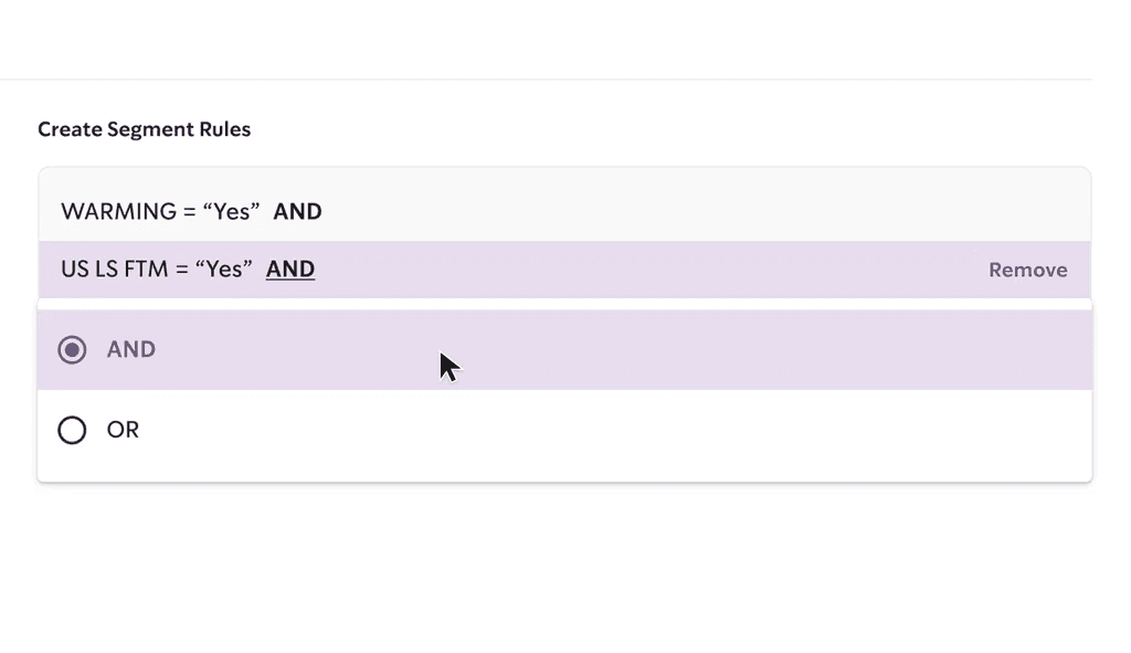
Seamless, Guided Instruction
The step-by-step process of rule creation makes training and coverage easy. This alleviates institutional knowledge bottlenecks previously experienced.

Ways to Validate Success
The step-by-step process of rule creation makes training and coverage easy. This alleviates institutional knowledge bottlenecks previously experienced.
Research & Stakeholder Workshop
I co-ran a collaboration workshop for our stakeholders to align on success criteria, review the competitive/comparative landscape, and define our experience principles.
In addition, I supported my research team in their facilitation of semi-structured interviews and card-sorting activities.
Status
Completed
Design Effort
1 week
Impact
My emphasis on DEI authenticity and use of empathic, humanistic language won over our stakeholders; they felt we truly understood their mission and trusted us to build their site.
The Problem
Our client's legacy tool for segmentation was outdated, confusing to navigate, and difficult to learn. Although segmentation tasks occurred only a few times per season, it was vital to the business's success. And only two people knew how to properly use the tool. 💀
client’s legacy segmentation tool
Confusing information hierarchy
Lack of guidance for new users
Visually outdated
Unintuitive condition names and grouping
"It's a lot of clicks"
Why this matters
When institutional knowledge is limited to one or two individuals, an organization faces significant risk and cost in providing coverage for them.
Design Iterations
Working with product managers to define the immediate requirements, I set out to tackle the major pain points for users: the unintuitive UI and confusing information hierarchy.
using the design system
Version 1
In an attempt to reduce the # of clicks for the user, I designed a search + drag + drop pattern that would allow users to visually create rule-sets and condition groups.
This interaction re-used design patterns found elsewhere in the tool.
× Developers pushed back against the drag and drop interaction, citing difficulty and scope needed to create.
multi-Select
Version 2
As a result of tech feedback, I changed drag-and-drop interaction to use multi-select instead.
Conditions were grouped in a way that would be easy to scan and find, even for a new user to the tool.
× The user experience suffered as a result; users would still need to click just as many times to create a rule-set.
× Furthermore, dirty data prevented us from re-structuring their data hierarchy.
type-ahead pattern
Version 3
I couldn't get around the 'dirty-data' issue as that was entirely out of scope for our team to tackle. However, I pushed back against a user experience that would mirror the existing tools our users would using. '
The new design uses 'type-ahead' to allow users to construct rules. # of Stores was elevated in the hierarchy as users relied on it to validate the conditions they were selecting.
✓ This design balanced technical constraints with an improved user experience
Usability & Feedback
According to my users, the segment creation and validation process was greatly improved. The time it took to learn and create a segment was reduced to just a few minutes.
I conducted usability testing on my two users, asking them to perform basic tasks and talking me through any pain points they still felt. Minor UI tweaks were made by my team.
Primary user
[This is] super easy!
Feedback
The rule-creation empty state needed to be more visually obvious
The conditions should be ordered alphabetically
Rule deletion needed to be made more obvious
Features & Improvements
Improved Hierarchy of Data
Clear entry to rule creation and prominent placement of # stores allows for users to easily create accurate segments
Seamless, Guided Instruction
The step-by-step process of rule creation makes training and coverage easy. This alleviates institutional knowledge bottlenecks previously experienced.
Ways to Validate Success
The step-by-step process of rule creation makes training and coverage easy. This alleviates institutional knowledge bottlenecks previously experienced.
Homepage & Information Architecture
I designed the homepage and IA to welcome and guide patients and caregivers, as well as built trust and reputation with corporate donors.
Status
Completed
Design Effort
3 days
Goal
Encourage users to explore the site, sign up for email updates, and eventually begin the process of volunteering for clinical trials

Homepage & Information Architecture
I designed the homepage and IA to welcome and guide patients and caregivers, as well as built trust and reputation with corporate donors.
Status
Completed
Design Effort
3 days
Goal
Encourage users to explore the site, sign up for email updates, and eventually begin the process of volunteering for clinical trials
The Problem
Our client's legacy tool for segmentation was outdated, confusing to navigate, and difficult to learn. Although segmentation tasks occurred only a few times per season, it was vital to the business's success. And only two people knew how to properly use the tool. 💀
client’s legacy segmentation tool
Confusing information hierarchy
Lack of guidance for new users
Visually outdated
Unintuitive condition names and grouping
"It's a lot of clicks"
Why this matters
When institutional knowledge is limited to one or two individuals, an organization faces significant risk and cost in providing coverage for them.
Design Iterations
Working with product managers to define the immediate requirements, I set out to tackle the major pain points for users: the unintuitive UI and confusing information hierarchy.
using the design system
Version 1
In an attempt to reduce the # of clicks for the user, I designed a search + drag + drop pattern that would allow users to visually create rule-sets and condition groups.
This interaction re-used design patterns found elsewhere in the tool.
× Developers pushed back against the drag and drop interaction, citing difficulty and scope needed to create.
multi-Select
Version 2
As a result of tech feedback, I changed drag-and-drop interaction to use multi-select instead.
Conditions were grouped in a way that would be easy to scan and find, even for a new user to the tool.
× The user experience suffered as a result; users would still need to click just as many times to create a rule-set.
× Furthermore, dirty data prevented us from re-structuring their data hierarchy.
type-ahead pattern
Version 3
I couldn't get around the 'dirty-data' issue as that was entirely out of scope for our team to tackle. However, I pushed back against a user experience that would mirror the existing tools our users would using. '
The new design uses 'type-ahead' to allow users to construct rules. # of Stores was elevated in the hierarchy as users relied on it to validate the conditions they were selecting.
✓ This design balanced technical constraints with an improved user experience
Usability & Feedback
According to my users, the segment creation and validation process was greatly improved. The time it took to learn and create a segment was reduced to just a few minutes.
I conducted usability testing on my two users, asking them to perform basic tasks and talking me through any pain points they still felt. Minor UI tweaks were made by my team.
Primary user
[This is] super easy!
Feedback
The rule-creation empty state needed to be more visually obvious
The conditions should be ordered alphabetically
Rule deletion needed to be made more obvious
Features & Improvements
Improved Hierarchy of Data
Clear entry to rule creation and prominent placement of # stores allows for users to easily create accurate segments
Seamless, Guided Instruction
The step-by-step process of rule creation makes training and coverage easy. This alleviates institutional knowledge bottlenecks previously experienced.
Ways to Validate Success
The step-by-step process of rule creation makes training and coverage easy. This alleviates institutional knowledge bottlenecks previously experienced.
Homepage & Information Architecture
I designed the homepage and IA to welcome and guide patients and caregivers, as well as built trust and reputation with corporate donors.
Status
Completed
Design Effort
3 days
Goal
Encourage users to explore the site, sign up for email updates, and eventually begin the process of volunteering for clinical trials
The Problem
Our client's legacy tool for segmentation was outdated, confusing to navigate, and difficult to learn. Although segmentation tasks occurred only a few times per season, it was vital to the business's success. And only two people knew how to properly use the tool. 💀
client’s legacy segmentation tool
Confusing information hierarchy
Lack of guidance for new users
Visually outdated
Unintuitive condition names and grouping
"It's a lot of clicks"
Why this matters
When institutional knowledge is limited to one or two individuals, an organization faces significant risk and cost in providing coverage for them.
Design Iterations
Working with product managers to define the immediate requirements, I set out to tackle the major pain points for users: the unintuitive UI and confusing information hierarchy.
using the design system
Version 1
In an attempt to reduce the # of clicks for the user, I designed a search + drag + drop pattern that would allow users to visually create rule-sets and condition groups.
This interaction re-used design patterns found elsewhere in the tool.
× Developers pushed back against the drag and drop interaction, citing difficulty and scope needed to create.
multi-Select
Version 2
As a result of tech feedback, I changed drag-and-drop interaction to use multi-select instead.
Conditions were grouped in a way that would be easy to scan and find, even for a new user to the tool.
× The user experience suffered as a result; users would still need to click just as many times to create a rule-set.
× Furthermore, dirty data prevented us from re-structuring their data hierarchy.
type-ahead pattern
Version 3
I couldn't get around the 'dirty-data' issue as that was entirely out of scope for our team to tackle. However, I pushed back against a user experience that would mirror the existing tools our users would using. '
The new design uses 'type-ahead' to allow users to construct rules. # of Stores was elevated in the hierarchy as users relied on it to validate the conditions they were selecting.
✓ This design balanced technical constraints with an improved user experience
Usability & Feedback
According to my users, the segment creation and validation process was greatly improved. The time it took to learn and create a segment was reduced to just a few minutes.
I conducted usability testing on my two users, asking them to perform basic tasks and talking me through any pain points they still felt. Minor UI tweaks were made by my team.
Primary user
[This is] super easy!
Feedback
The rule-creation empty state needed to be more visually obvious
The conditions should be ordered alphabetically
Rule deletion needed to be made more obvious
Features & Improvements
Improved Hierarchy of Data
Clear entry to rule creation and prominent placement of # stores allows for users to easily create accurate segments
Seamless, Guided Instruction
The step-by-step process of rule creation makes training and coverage easy. This alleviates institutional knowledge bottlenecks previously experienced.
Ways to Validate Success
The step-by-step process of rule creation makes training and coverage easy. This alleviates institutional knowledge bottlenecks previously experienced.
Debunk Myth Module
I pitched and designed these interactive modules to educate and debunk commonly held assumptions about clinical trials.
Status
Completed
Design Effort
1 week
Goal
Educate visitors on clinical trials with the goal of driving conversation and participation
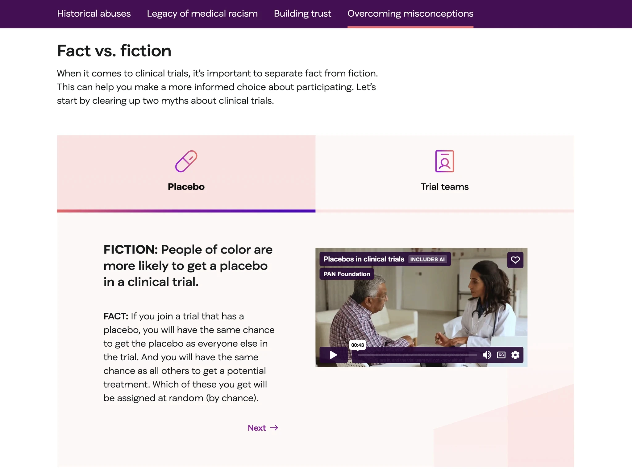
Debunk Myth Module
I pitched and designed these interactive modules to educate and debunk commonly held assumptions about clinical trials.
Status
Completed
Design Effort
1 week
Goal
Educate visitors on clinical trials with the goal of driving conversation and participation
The Problem
Our client's legacy tool for segmentation was outdated, confusing to navigate, and difficult to learn. Although segmentation tasks occurred only a few times per season, it was vital to the business's success. And only two people knew how to properly use the tool. 💀
client’s legacy segmentation tool
Confusing information hierarchy
Lack of guidance for new users
Visually outdated
Unintuitive condition names and grouping
"It's a lot of clicks"
Why this matters
When institutional knowledge is limited to one or two individuals, an organization faces significant risk and cost in providing coverage for them.
Design Iterations
Working with product managers to define the immediate requirements, I set out to tackle the major pain points for users: the unintuitive UI and confusing information hierarchy.
using the design system
Version 1
In an attempt to reduce the # of clicks for the user, I designed a search + drag + drop pattern that would allow users to visually create rule-sets and condition groups.
This interaction re-used design patterns found elsewhere in the tool.
× Developers pushed back against the drag and drop interaction, citing difficulty and scope needed to create.
multi-Select
Version 2
As a result of tech feedback, I changed drag-and-drop interaction to use multi-select instead.
Conditions were grouped in a way that would be easy to scan and find, even for a new user to the tool.
× The user experience suffered as a result; users would still need to click just as many times to create a rule-set.
× Furthermore, dirty data prevented us from re-structuring their data hierarchy.
type-ahead pattern
Version 3
I couldn't get around the 'dirty-data' issue as that was entirely out of scope for our team to tackle. However, I pushed back against a user experience that would mirror the existing tools our users would using. '
The new design uses 'type-ahead' to allow users to construct rules. # of Stores was elevated in the hierarchy as users relied on it to validate the conditions they were selecting.
✓ This design balanced technical constraints with an improved user experience
Usability & Feedback
According to my users, the segment creation and validation process was greatly improved. The time it took to learn and create a segment was reduced to just a few minutes.
I conducted usability testing on my two users, asking them to perform basic tasks and talking me through any pain points they still felt. Minor UI tweaks were made by my team.
Primary user
[This is] super easy!
Feedback
The rule-creation empty state needed to be more visually obvious
The conditions should be ordered alphabetically
Rule deletion needed to be made more obvious
Features & Improvements
Improved Hierarchy of Data
Clear entry to rule creation and prominent placement of # stores allows for users to easily create accurate segments
Seamless, Guided Instruction
The step-by-step process of rule creation makes training and coverage easy. This alleviates institutional knowledge bottlenecks previously experienced.
Ways to Validate Success
The step-by-step process of rule creation makes training and coverage easy. This alleviates institutional knowledge bottlenecks previously experienced.
Debunk Myth Module
I pitched and designed these interactive modules to educate and debunk commonly held assumptions about clinical trials.
Status
Completed
Design Effort
1 week
Goal
Educate visitors on clinical trials with the goal of driving conversation and participation
The Problem
Our client's legacy tool for segmentation was outdated, confusing to navigate, and difficult to learn. Although segmentation tasks occurred only a few times per season, it was vital to the business's success. And only two people knew how to properly use the tool. 💀
client’s legacy segmentation tool
Confusing information hierarchy
Lack of guidance for new users
Visually outdated
Unintuitive condition names and grouping
"It's a lot of clicks"
Why this matters
When institutional knowledge is limited to one or two individuals, an organization faces significant risk and cost in providing coverage for them.
Design Iterations
Working with product managers to define the immediate requirements, I set out to tackle the major pain points for users: the unintuitive UI and confusing information hierarchy.
using the design system
Version 1
In an attempt to reduce the # of clicks for the user, I designed a search + drag + drop pattern that would allow users to visually create rule-sets and condition groups.
This interaction re-used design patterns found elsewhere in the tool.
× Developers pushed back against the drag and drop interaction, citing difficulty and scope needed to create.
multi-Select
Version 2
As a result of tech feedback, I changed drag-and-drop interaction to use multi-select instead.
Conditions were grouped in a way that would be easy to scan and find, even for a new user to the tool.
× The user experience suffered as a result; users would still need to click just as many times to create a rule-set.
× Furthermore, dirty data prevented us from re-structuring their data hierarchy.
type-ahead pattern
Version 3
I couldn't get around the 'dirty-data' issue as that was entirely out of scope for our team to tackle. However, I pushed back against a user experience that would mirror the existing tools our users would using. '
The new design uses 'type-ahead' to allow users to construct rules. # of Stores was elevated in the hierarchy as users relied on it to validate the conditions they were selecting.
✓ This design balanced technical constraints with an improved user experience
Usability & Feedback
According to my users, the segment creation and validation process was greatly improved. The time it took to learn and create a segment was reduced to just a few minutes.
I conducted usability testing on my two users, asking them to perform basic tasks and talking me through any pain points they still felt. Minor UI tweaks were made by my team.
Primary user
[This is] super easy!
Feedback
The rule-creation empty state needed to be more visually obvious
The conditions should be ordered alphabetically
Rule deletion needed to be made more obvious
Features & Improvements
Improved Hierarchy of Data
Clear entry to rule creation and prominent placement of # stores allows for users to easily create accurate segments
Seamless, Guided Instruction
The step-by-step process of rule creation makes training and coverage easy. This alleviates institutional knowledge bottlenecks previously experienced.
Ways to Validate Success
The step-by-step process of rule creation makes training and coverage easy. This alleviates institutional knowledge bottlenecks previously experienced.
Challenges
What made this project difficult
How did I deal with it
Technical constraints meant a change in requirements. A number of features meant to drive participation in clinical trials were scaled back in favor of emphasizing education around the topic
I re-organized the hierarchy of elements to prioritize educational modules and worked with content writers to re-frame the story we were trying to tell with the site.
A lack of branding from a 3rd party group blocked us from designing with higher fidelity visuals and finalized content.
I relied on using stand-in copy and gray boxes to lock down the UX and structure of the site.
Challenges
What made this project difficult
How did I deal with it
Technical constraints meant a change in requirements. A number of features meant to drive participation in clinical trials were scaled back in favor of emphasizing education around the topic
I re-organized the hierarchy of elements to prioritize educational modules and worked with content writers to re-frame the story we were trying to tell with the site.
A lack of branding from a 3rd party group blocked us from designing with higher fidelity visuals and finalized content.
I relied on using stand-in copy and gray boxes to lock down the UX and structure of the site.
Challenges
What made this project difficult
Technical constraints meant a change in requirements. A number of features meant to drive participation in clinical trials were scaled back in favor of emphasizing education around the topic
How did I deal with it
I re-organized the hierarchy of elements to prioritize educational modules and worked with content writers to re-frame the story we were trying to tell with the site.
What made this project difficult
A lack of branding from a 3rd party group blocked us from designing with higher fidelity visuals and finalized content.
How did I deal with it
I relied on using stand-in copy and gray boxes to lock down the UX and structure of the site.
Impact
The clinical trials micro-site was unveiled on Oct 2024 as part of PAN's Opening Doors to Clinical Trials initiative.
In the news
MSN highlights less than 1% of U.S clinical trials include trans patients and promotes PAN's clinical trial initiative
Clinical Leader interviews PAN Foundation Chief Mission Officer Amy Niles with the micro-site's launch
Impact
The clinical trials micro-site was unveiled on Oct 2024 as part of PAN's Opening Doors to Clinical Trials initiative.
In the news
MSN highlights less than 1% of U.S clinical trials include trans patients and promotes PAN's clinical trial initiative
Clinical Leader interviews PAN Foundation Chief Mission Officer Amy Niles with the micro-site's launch
Impact
The clinical trials micro-site was unveiled on Oct 2024 as part of PAN's Opening Doors to Clinical Trials initiative.
In the news
MSN highlights less than 1% of U.S clinical trials include trans patients and promotes PAN's clinical trial initiative
Clinical Leader interviews PAN Foundation Chief Mission Officer Amy Niles with the micro-site's launch
Impact
The clinical trials micro-site was unveiled on Oct 2024 as part of PAN's Opening Doors to Clinical Trials initiative.
In the news
MSN highlights less than 1% of U.S clinical trials include trans patients and promotes PAN's clinical trial initiative
Clinical Leader interviews PAN Foundation Chief Mission Officer Amy Niles with the micro-site's launch
Testimonials
Content Writer
One of Xing's remarkable strengths was their ability to adapt to changing client feedback and unforeseen shifts in the client's mindset throughout the project.
Nechumah Getz, Chief Strategy Officer
I love it!
Product Manager
She eloquently incorporated DEI aspects into their work and within client calls, effectively representing our project's ethics and mission. Xing also excels in taking on more complex components and features, consistently producing outstanding results.
Lead Designer
Her dedication and skillset have undoubtedly had a positive impact on our team and project.
Testimonials
Content Writer
One of Xing's remarkable strengths was their ability to adapt to changing client feedback and unforeseen shifts in the client's mindset throughout the project.
Nechumah Getz, Chief Strategy Officer
I love it!
Product Manager
She eloquently incorporated DEI aspects into their work and within client calls, effectively representing our project's ethics and mission. Xing also excels in taking on more complex components and features, consistently producing outstanding results.
Lead Designer
Her dedication and skillset have undoubtedly had a positive impact on our team and project.
Testimonials
Content Writer
One of Xing's remarkable strengths was their ability to adapt to changing client feedback and unforeseen shifts in the client's mindset throughout the project.
Nechumah Getz, Chief Strategy Officer
I love it!
Product Manager
She eloquently incorporated DEI aspects into their work and within client calls, effectively representing our project's ethics and mission. Xing also excels in taking on more complex components and features, consistently producing outstanding results.
Lead Designer
Her dedication and skillset have undoubtedly had a positive impact on our team and project.
Testimonials
Content Writer
One of Xing's remarkable strengths was their ability to adapt to changing client feedback and unforeseen shifts in the client's mindset throughout the project.
Nechumah Getz, Chief Strategy Officer
I love it!
Product Manager
She eloquently incorporated DEI aspects into their work and within client calls, effectively representing our project's ethics and mission. Xing also excels in taking on more complex components and features, consistently producing outstanding results.
Lead Designer
Her dedication and skillset have undoubtedly had a positive impact on our team and project.
finished looking?
finished looking?
finished looking?
finished looking?
© Zixing Guo 2025
© Zixing Guo 2025
© Zixing Guo 2025
© Zixing Guo 2025